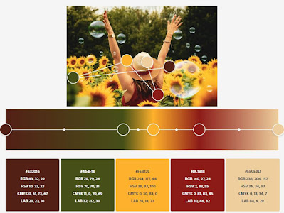
And then it dawned on me. Without knowing it, I had used that palette when I designed the Sunflower table runner, purchasing the red, brown, and yellow fabrics on one LQS shopping trip because they played so well together.
More Sunflower Color Palettes
With all of that playing, it sent me down the road of finding more sunflower pictures. What do you think of these for sunflower palette inspirations?
Ladybug Color Palettes
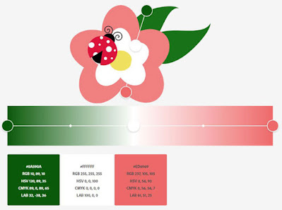
Here's a few more palettes to share, but instead of sunflowers, they're based on ladybugs. The first one is simple, just three colors pulled from this graphic.
Adding two more color gradients to the mix, plus hand-picking the colors, results in this.
Quite striking, and reminds me of my Ladybug Dance wall hanging, though I chose more red than coral and eliminated the yellow.
More Ladybugs on Flowers
How about these? Here it's the same picture of a ladybug on blue flowers, but depending on the colors picked, results in two different palettes, both quite lovely.
And one last ladybug, this time on purple thistle. The first one is quite lovely with two greens, red, purple, and a neutral beige.
But if the dark green is substituted with the black/grey (or even a dark blue) from the ladybug's spots, then an even more lively color palette evolves.
I'm really loving that one - how about you?
Choosing Photos for Color Palettes
Have I given you color overload today? The week started with 3 Ideas for Finding the Perfect Color Palette, which includes a list of my favorite palette generating programs, and concludes today with generating your own from any of the stunning photos found on the web.
And notice I say 'stunning photos', those whose color compositions that are already exciting. I could have chosen a clear, crisp photo of a sunflower against a blue sky, like this one.
But I know what I'm going to get - bright yellow, orange, dark green, and blue. Sure, that's okay, but really not very exciting, and not worth my time putting it through one of the palette generator programs. With the other photo examples from above, I specifically chose those photos because they had unexpected color pairings - yellow with aqua; purple with yellow and brown; red with light blue.
For fun, I'll pull out my favorite color wheel tool, The Ultimate 3-in-1 Color Tool (or any color wheel tool),
and I see that yellow and aqua are two legs of a triad, as are purple with orange-yellow, and red with blue. Now isn't this all starting to make sense? These colors are destined to be together, though we don't realize it. And that's what makes these photos stand out.
To wrap this up, color palettes are numerous for any given photo. It just takes a great photo, and the willingness to pick colors for a pleasing palette. I hope I've inspired you to study color more closely, and to seek beautiful, inspirational color palettes. It's those bits of unexpected that will make a beautiful quilt!
Happy Quilting!

My Favorite Patterns


These color generators are too much fun!!!! I had to be called TWICE to dinner. Ladybug quilt kind of looks like you put the green and yellow together, sunshine green. Thanks for sharing this.
ReplyDeleteWell, that was fun! Lots to think about and try! Thanks,
ReplyDeleteThat sounds like a fun time actually!
ReplyDelete